Leading Design at Mote
I joined Mote in May 2021 as the sole designer, immediately bridging the gap between strategy and design. From unveiling a research methodology to elevating accessibility and crafting engaging features, my Mote journey transformed challenges into opportunities, resulting in millions of users and a prestigious team award from Google.
Upon joining Mote, I embraced a whirlwind. Our product, an audio toolkit integrated into Google for Education, was making waves in the education world.
However, with rapid growth came unique challenges. I found myself navigating a blend of evolving strategies, fragmented design, and the intricacies of scaling our product past its reliance on Chrome.
INSIGHT
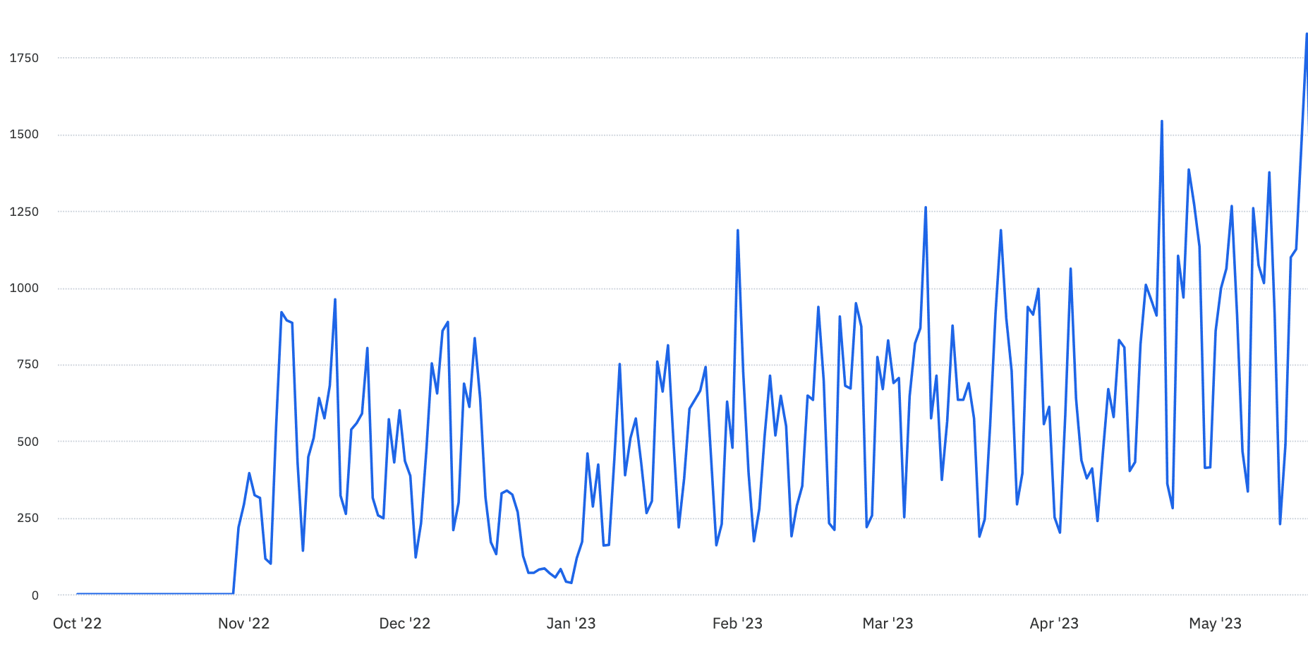
The year before my arrival, Mote had gone from 0 → 638K extension installations, in the two years following my arrival that grew to 12.3M.
Working alongside a small remote team, my objective was to unravel the complexity, refine our design approach and explore avenues for growth in a world that was shifting back to post-pandemic normality.
Early on, I recognized the untapped potential in the raw, unstructured user data we had been gathering. An early move was the creation of the Insights Engine, a consolidated hub for user feedback.
Through an atomic approach, I was able to transform raw insights into actionable recommendations that tied to real customer needs.
INSIGHT
The Insights Engine enabled me to digest and analyse over 6,000+ data points. These helped us prioritise work and progress on the tool.
I built connections with educators that were indispensable. The relationships helped me to understand the challenges they faced. Regular sessions not only helped validate design hypotheses but also illuminated areas for impact and improvement.
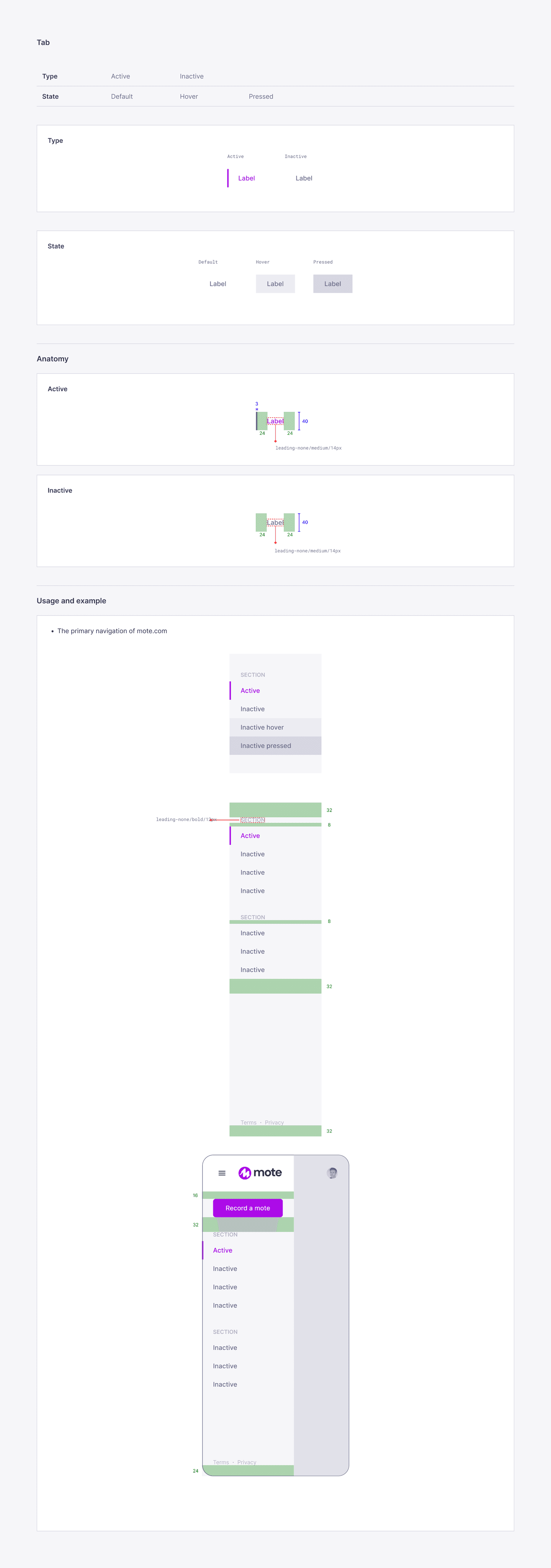
Mote's integration with Google for Education was a priority. The tool was currently functional, but lacked consistency across integrations in terms of functional behaviour and UI elements.

The goal became to seamlessly integrate a consistent set of components with Mote's unique style while maintaining consistency with Google's aesthetic, as to not look out of place.
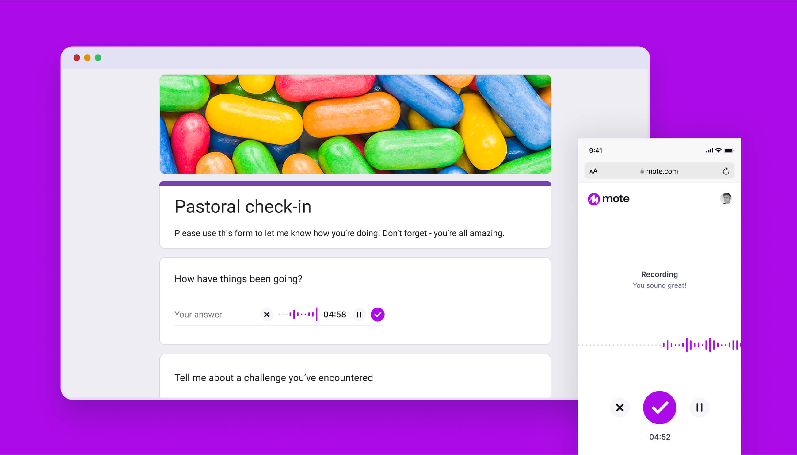
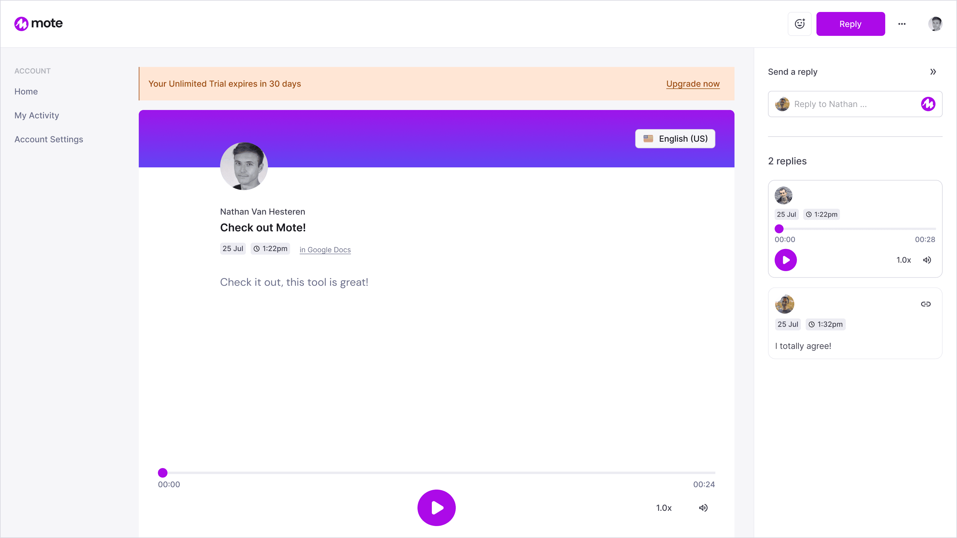
The primary challenge centred around the recorder experience. The mote activator button was crucial in representing our brand identity. The icon was present wherever Mote was able to be used.
This posed user experience issues, as newcomers to Mote might not immediately recognize it as a 'record' button. Despite this, its significance to our brand identity was non-negotiable, so the design had to adapt.
I designed a histogram to react to the user's voice. This approach not only visually distinguished the experience but also added a touch of much-needed visual feedback.
The Mote Web Recorder was a significant project for several reasons:
It allowed users to access Mote without needing to install an extension, which was especially helpful in schools where installing extensions wasn't possible due to restricted Google account access.
It increased search traffic to Mote.com.
It made Mote accessible on mobile devices.
To enhance the playback experience, we tackled several improvements. We introduced a much-requested translation read-aloud feature and added accessibility options like text highlighting on timestamped transcriptions.
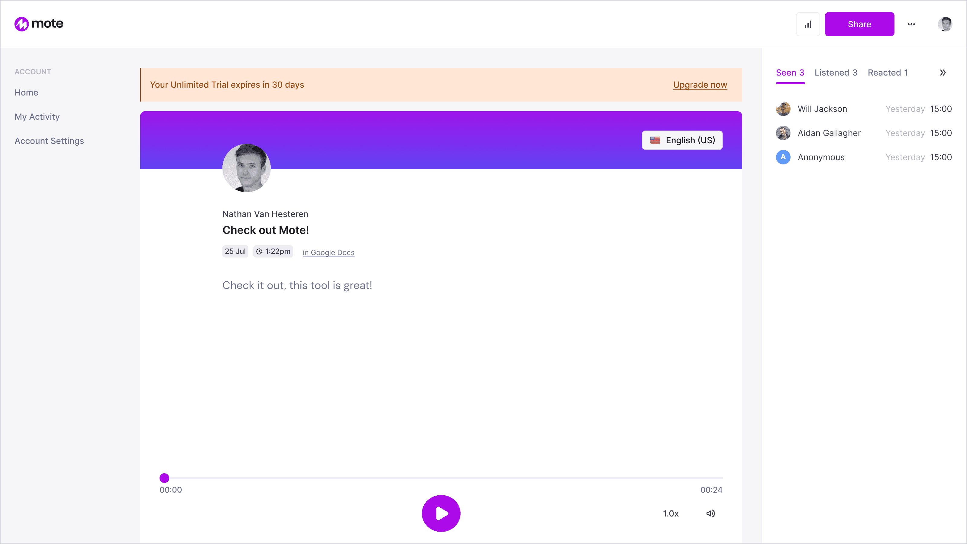
A crucial part of this development was creating a design framework for the Mote cards. This ensured that the cards worked seamlessly across different integrations and adapted well to various screen sizes, enhancing overall usability.
I am a foreign language teacher and sometimes I give dictations to my students. It works perfectly for absent students or teachers and has so many uses like recording voices with different accents.
RESEARCH USED TO INFORM TEXT HIGHLIGHTING
The results indicated that children with developmental dyslexia found it easier to read along when audio was synchronized with text highlighting. Specifically, for the highlighting style that used a blue band for whole sentences, this was found to be effective.
https://online-journals.org/index.php/i-jet/article/view/8736/5161
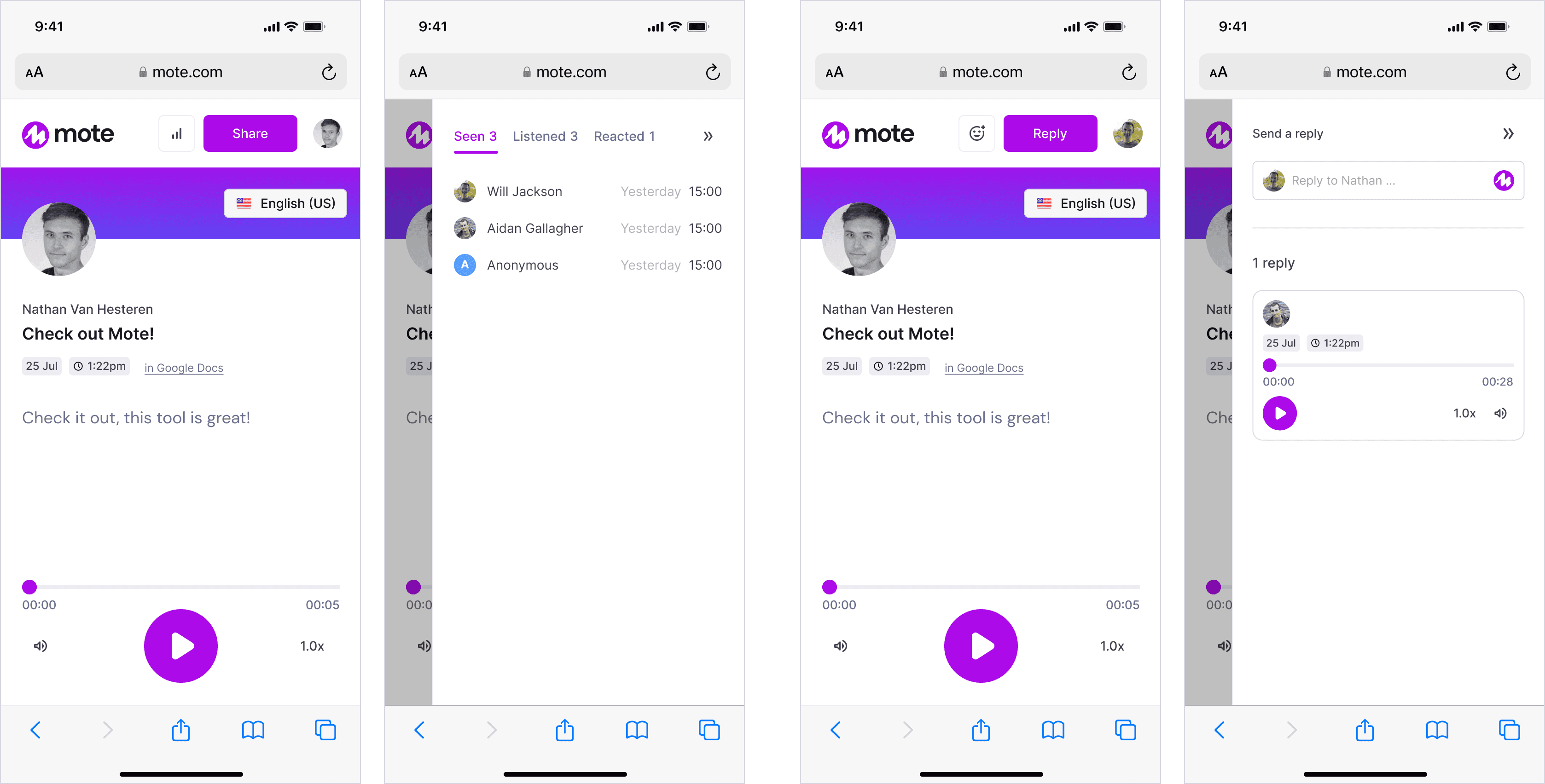
Along with updating the play cards, we also redesigned the landing page experience. These landing pages were crucial as they were the primary destination for users who didn't have the Chrome extension installed.
A significant portion of our traffic, about 30%, came from student users on mobile devices. This highlighted the importance of designing with mobile users in mind. To address this, we developed a fluid layout that provided a seamless transition from desktop to mobile, ensuring a user-friendly experience regardless of the device used.
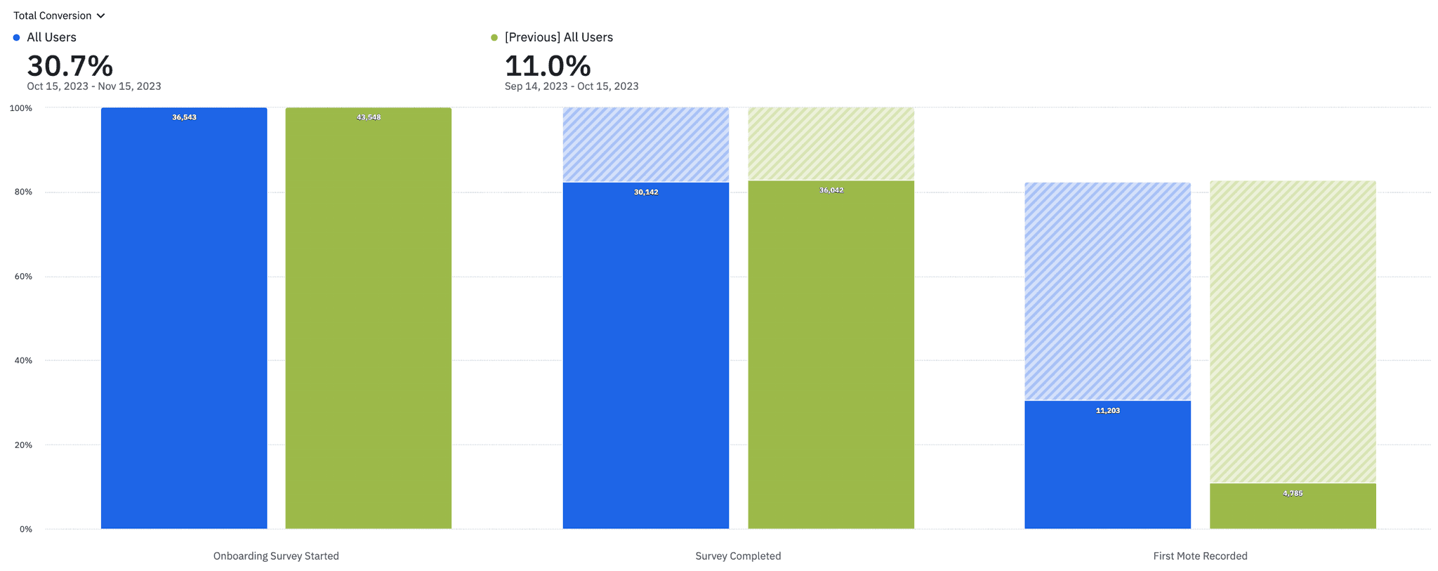
We made substantial improvements to our sign-up process through design iteration. Our conversion rate increased from 33% to 82.5%, indicating a major enhancement in efficiency through the removal of unnecessary steps, and reordering of information.
INSIGHT
Median completion time to complete the onboarding flow decreased from 29 seconds to 18 seconds
As a follow-on project, we added user education to our onboarding process to encourage new users to make their first recording immediately. We found users who record right away tend to stay with us longer.
We were able to boost conversion from 11% to 30.7%.
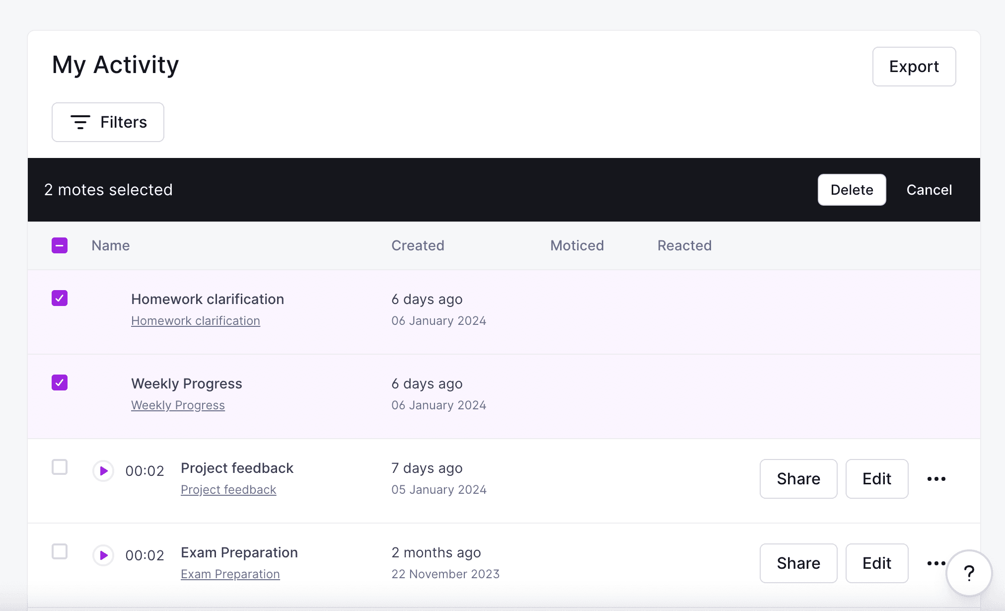
We focused on user feedback and insights to guide our development, complemented by engagement in research discovery sessions and our product feature request board.
This approach led to projects like improving the activity page enhancements whereby we added the ability to delete multiple Motes.
Despite the challenges of prioritising in a fast-paced startup with limited resource, we successfully implemented these highly requested features.
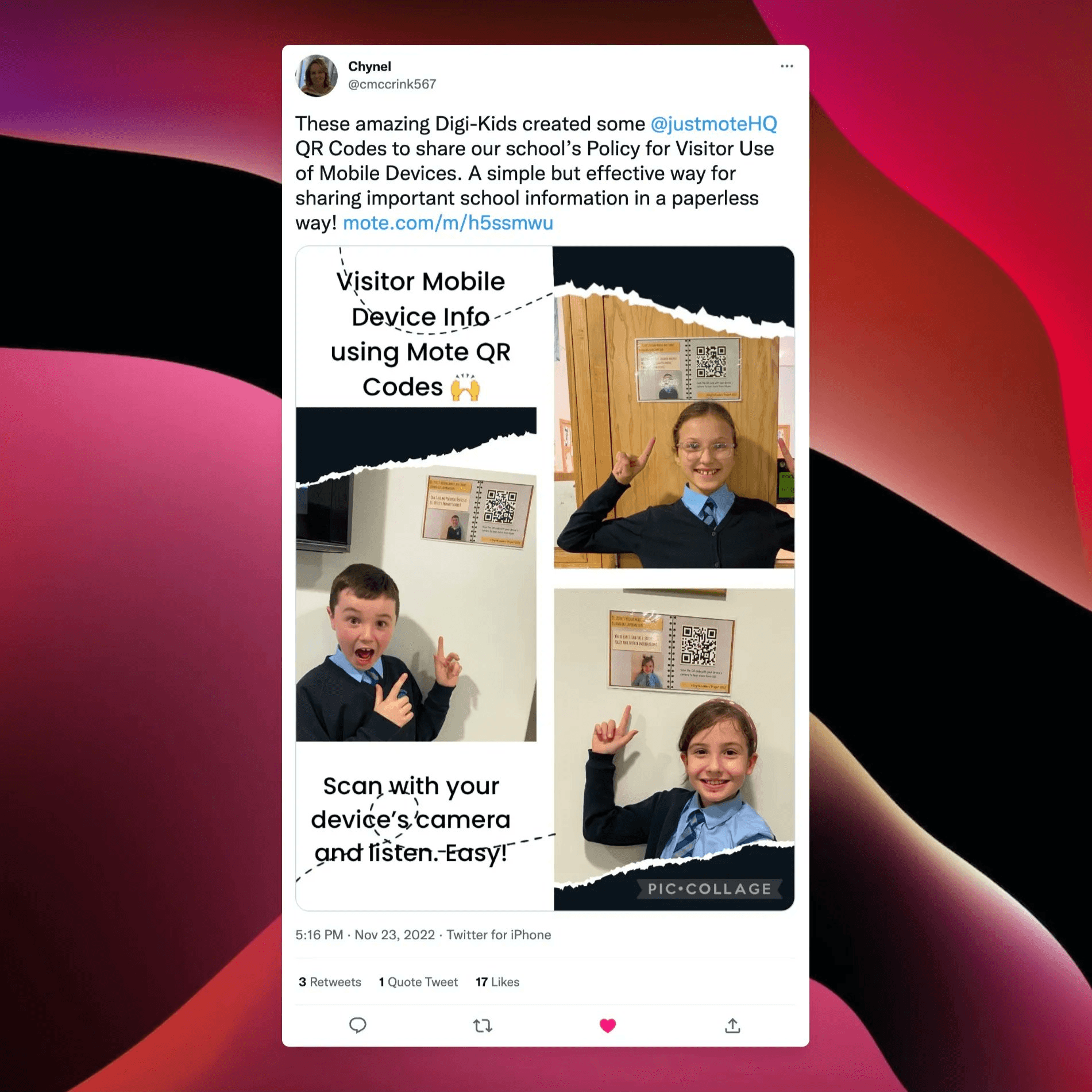
We introduced innovative additions such as embeds and QR codes. These acted as gateways for educators, to embed Mote into their daily toolkit.
"A simple but effective way for sharing important school information in a paperless way"
It is by far the easiest way to embed audio and remote teach! I find it so much easier than Loom. Love it!
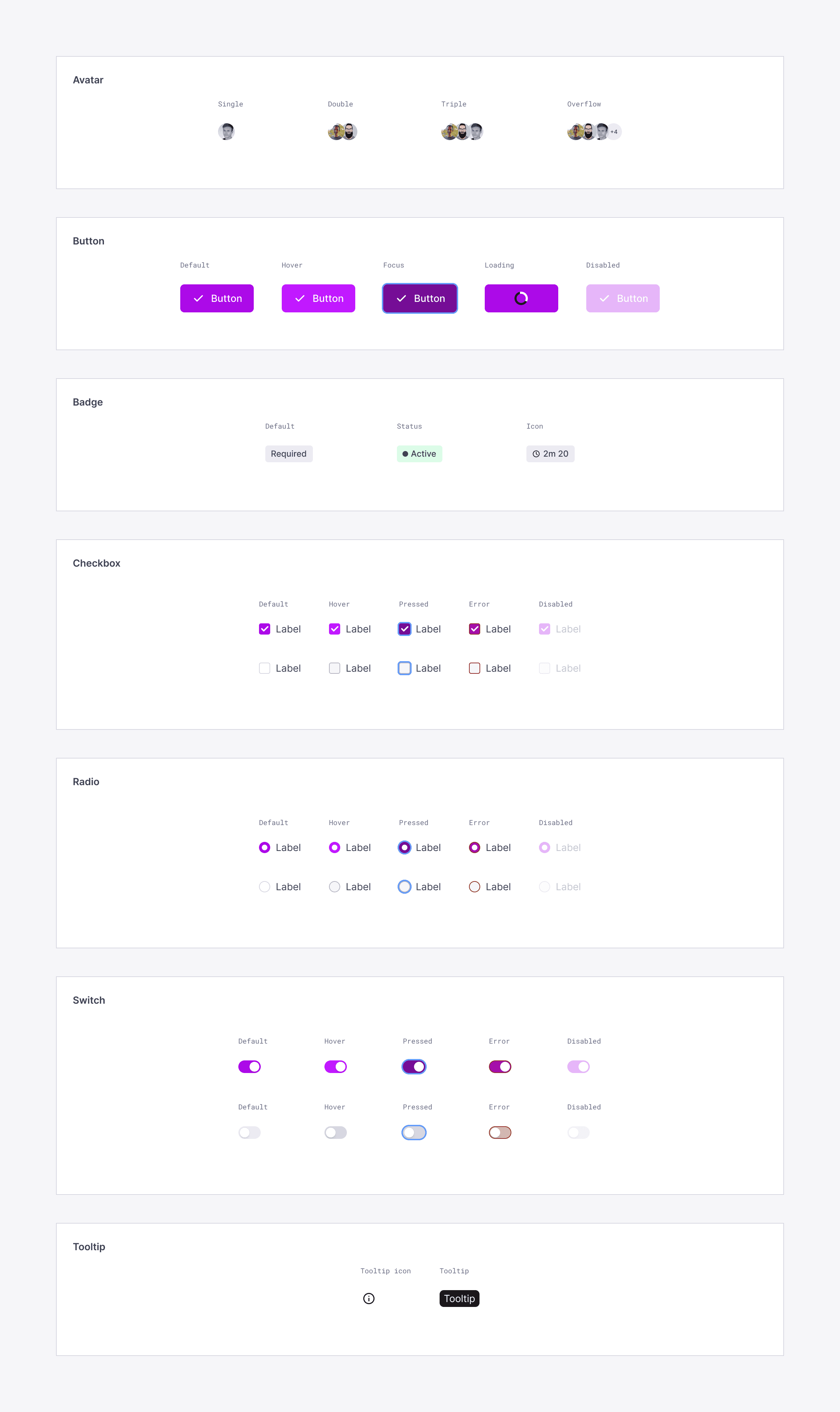
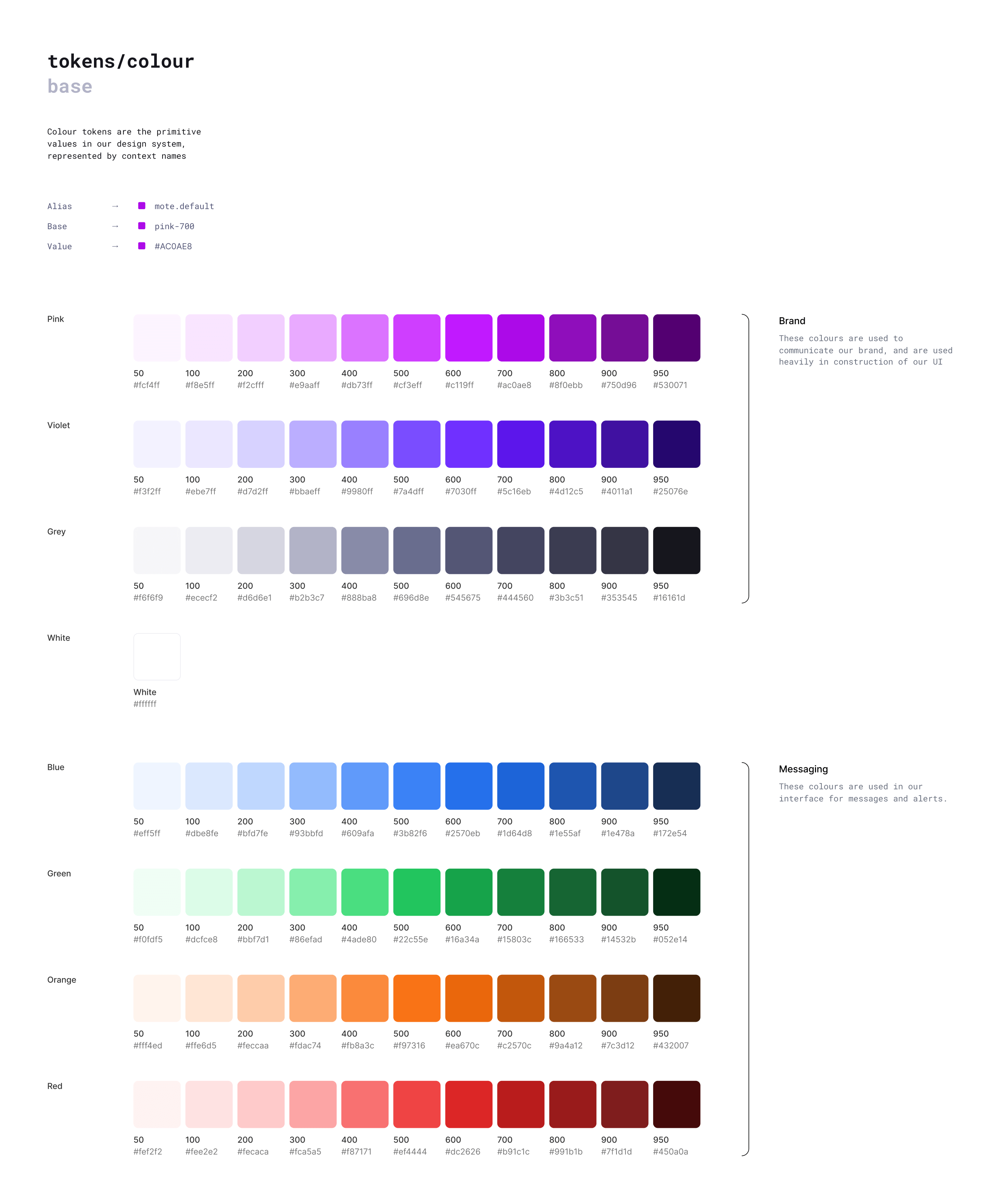
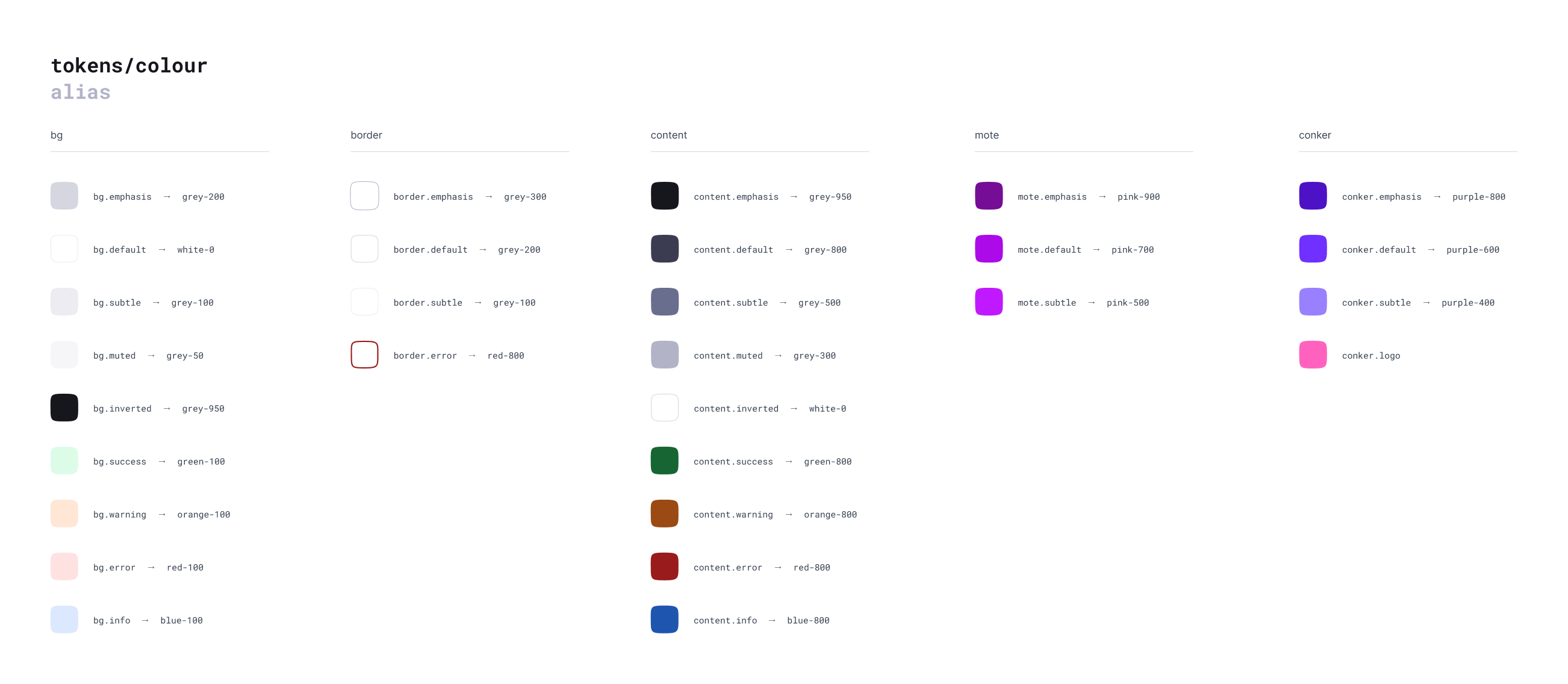
The rapid growth and frequent introduction of new features posed a challenge to maintaining a consistent design. To address this, I initiated a design system in partnership with our developers. This helped us maintain a uniform design style as we continued to innovate and grow.
Despite the challenges and resource constraints, the highlights for me have always been the moments of genuine appreciation from educators and those "aha" instances shared with our community. The journey, with all its highs and lows, has been truly rewarding!
Conker-ing quizzes with AI
conker

