Experimentation at WSJ

Over a five-year partnership with The Wall Street Journal, I worked across acquisition and retention initiatives that helped drive a 50% increase in active digital subscriptions, contributing to the Journal reaching its 3M subscriber target in 2020.
Through continuous experimentation across key customer journeys, I helped deliver a 40%+ increase in revenue per subscriber and validated new high-performing experiences, including a mobile acquisition flow which helped increase YoY sales by 20%.
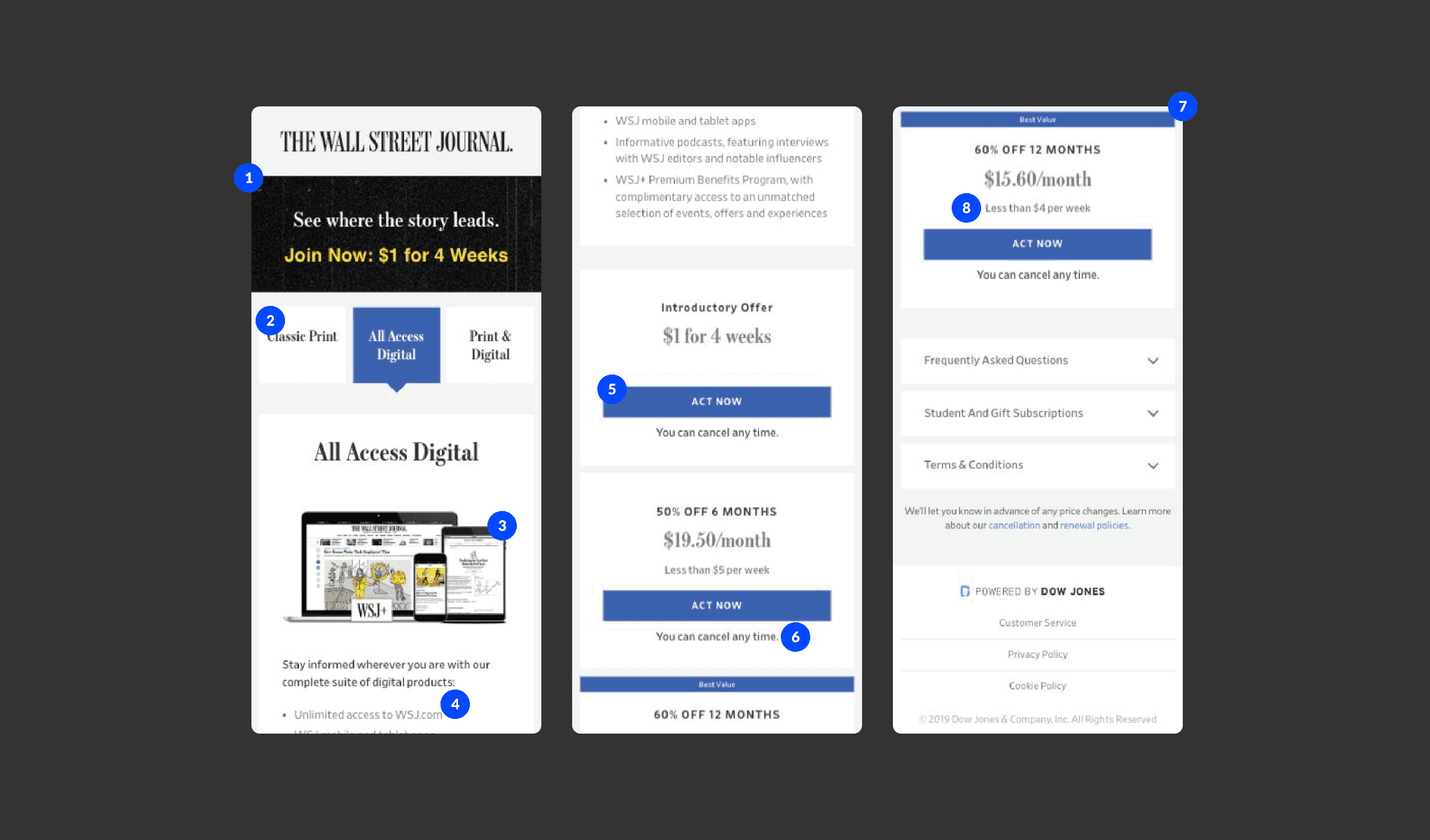
With an average of 192,000 users per month, the Wall Street Journal (WSJ) e-commerce experience sees a roughly 60% mobile device split. The existing layout displayed a matrix of three by three subscription terms, with nine in total. Research showed that over 85% of users did not explore multiple product or term lengths – this had a direct impact on conversion rate and ability to acquire new users.
CONVERSION GOALS
Visits to checkout (All)
Increase the conversion rate of visits to checkout. The current control sees a 2.1% conversion rate.
Visits to checkout (Intro Offer)
Use signposting to increase the current 0.82% conversion rate to intro offer checkout.
Total orders
Improve on the current 1.56% conversion rate and contribute to a +$1million incremental value target via mobile conversion.
Discovery
We had an abundance of insights at our disposal from that the research team had collected over time. These included both qualitative insights and quantitative data.
Qualitative
Past session recordings and remote usability studies showed that users were struggling with scroll depth. The lengthy control page was causing users to scroll up and down in a sporadic way to compare features across products.
Quantitative
Analytics showed us that over 93% of mobile users did not compare products. A decision was being solely made by the default product on show. Only 1.4% of users compare features across all three products.
Heuristic analysis
1 - Immediate Call To Action
There is no immediate call to action above the fold. This could be causing a poor conversion rate.
Hypothesis
We hypothesised that focussing on three areas would help us achieve our conversion goals. The three areas were:
Improve navigability between products
Improve the ability to compare product features
Improve the mechanism of switching between products
Qualitative Testing
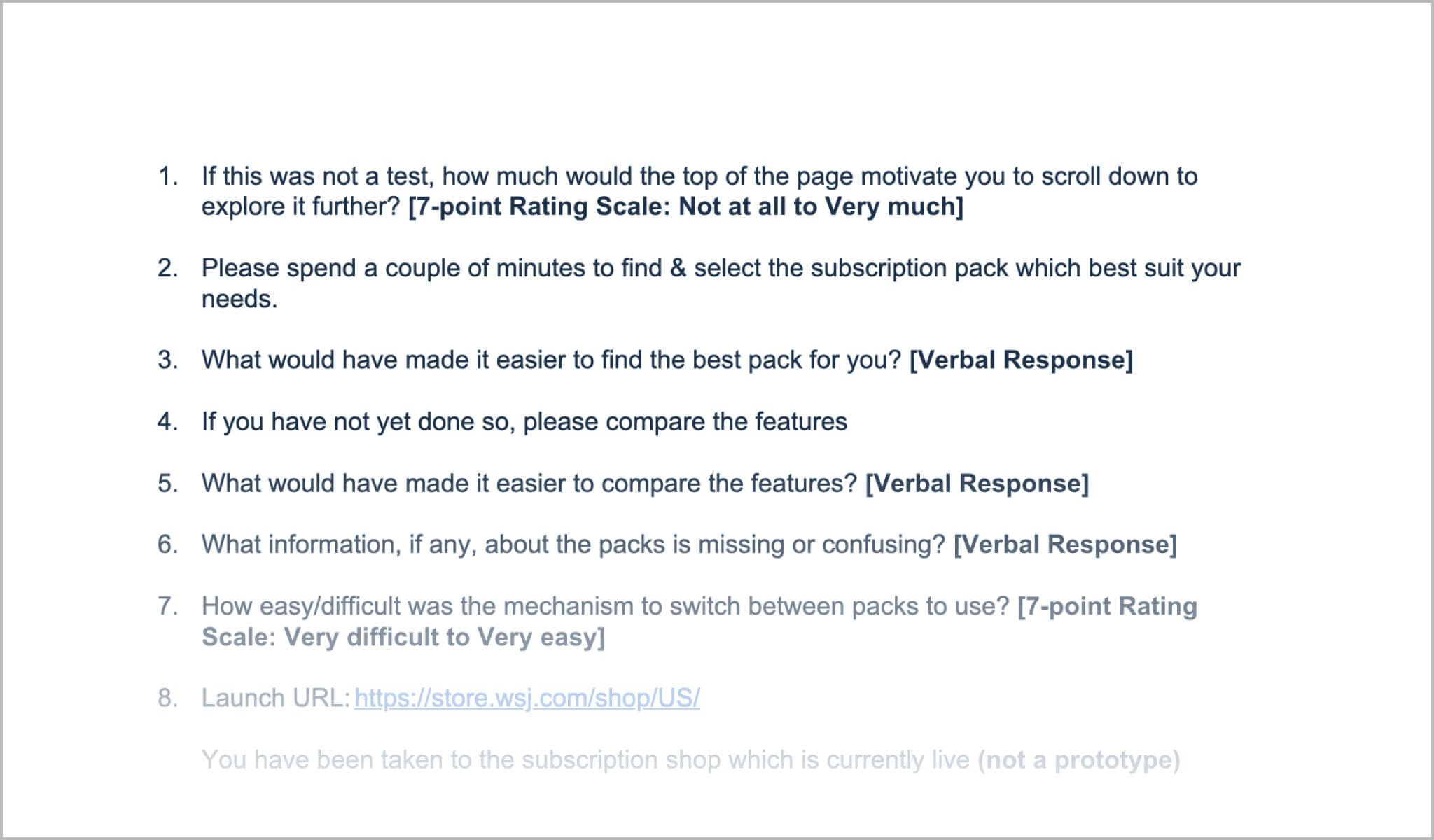
We recruited 12 users (3 for each prototype) within our target audience and set up a non moderated usability study. We wrote a task-based script to guide users through a purchase decision making process.
Prototype 1/4
Hypothesis
Chunking the journey into three phases will reduce cognitive load, thus reducing friction as the user navigates through the experience.
Findings
We saw users struggle with the three stepped journey. Users wanted more context around product features at step 1. The progress indicator also caused friction.
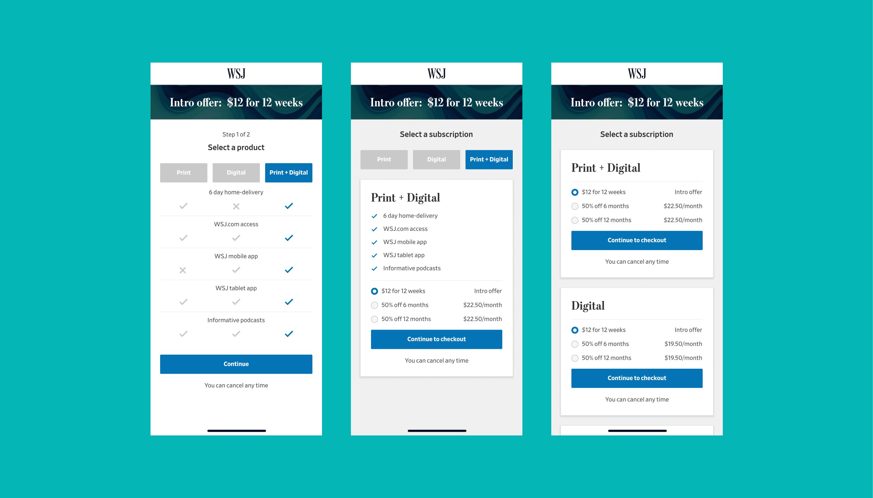
Prototype 2/4
Hypothesis
A columned layout will improve the users ability to compare features and switch between products.
Findings
Whilst testing positively overall , the progress indicator message caused confusion with 2 users.
Prototype 3/4
Hypothesis
Exposing features up front will provide vital context to users wanting to compare product features.
Findings
The card functionality (with no CTA) caused friction. Users expected that by tapping the card, the next step would be triggered.
Prototype 4/4
Hypothesis
Reducing the journey to a single step and exposing all subscription types will give users upfront context of all available options.
Findings
Users found a single step journey easy to understand. Although placement of the tooltip caused poor discoverability.
Quantitative Testing
Based on the findings from qualitative testing, we iterated and prepared the design for quantitative A/B/n testing. We used the insights gathered to construct a three variation test.

Variation 1
Based off prototype 2, we made adjustments to the progress indicator, opting for text to remove uncertainty.


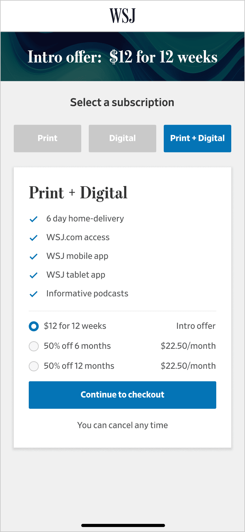
Variation 2 (Winner 🏆)
Based on prototype 4, we made small adjustments to the placement of the tooltip before launching this variation.
Variation 3
Combining prototype 2 and 4, the two strongest performers, we iterated by combining the two experiences into a single step.
Results and Learnings
Based on the findings from qualitative testing, we iterated and prepared the design for quantitative A/B/n testing. We used the insights gathered to construct a three variation test.
This project was a huge success. We hit all our key objectives. All three of our variations outperformed the control. Our winning variation exceeded our revenue target by over 20% and outperformed site conversion by over 8%.
All tests reached >99% statistical significance
Vists to checkout (All)
Conversion Rate
Improvement
Control
2.35%
-
Variation 1
3.65%
+55.16%
Variation 2
4.06%
+72.67%
Variation 3
3.41%
+45.11%
Vists to checkout (Intro Offer)
Conversion Rate
Improvement
Control
0.82%
-
Variation 1
2.59%
+214.46%
Variation 2
2.87%
+248.2%
Variation 3
2.41%
+191.99%
Total Orders
Conversion Rate
Improvement
Control
1.56%
-
Variation 1
1.69%
+8.35%
Variation 2
1.69%
+8.35%
Variation 3
1.67%
+6.49%
A strategic agency rebrand
DAYDOT

